

The perils of nostalgia are many, but the most common is the suspicion that things were better before. This is also known as “the truth.”
At least when it comes to hamburger stands.
If you look at the pictures of old fast-food joints, then compare them with the modern iterations, it’s obvious we’ve not only lost a marvelously garish piece of the suburban streetscape, we’ve traded commercial exuberance for something dark and dreary.
Old McDonald’s had a form, clean and bright and neat. With its slanted glass and its golden arches, McDonald’s represented the future, wrapped in enameled white walls, chrome and a dash of red.
Everyone knew what that building meant. Burgers, fries and shakes. You saw those great yellow parabolas from a block away, and you knew: Burgers, fries and shakes. It wasn’t a hardware store. It wasn’t a florist’s shop. Burgers, fries and shakes.
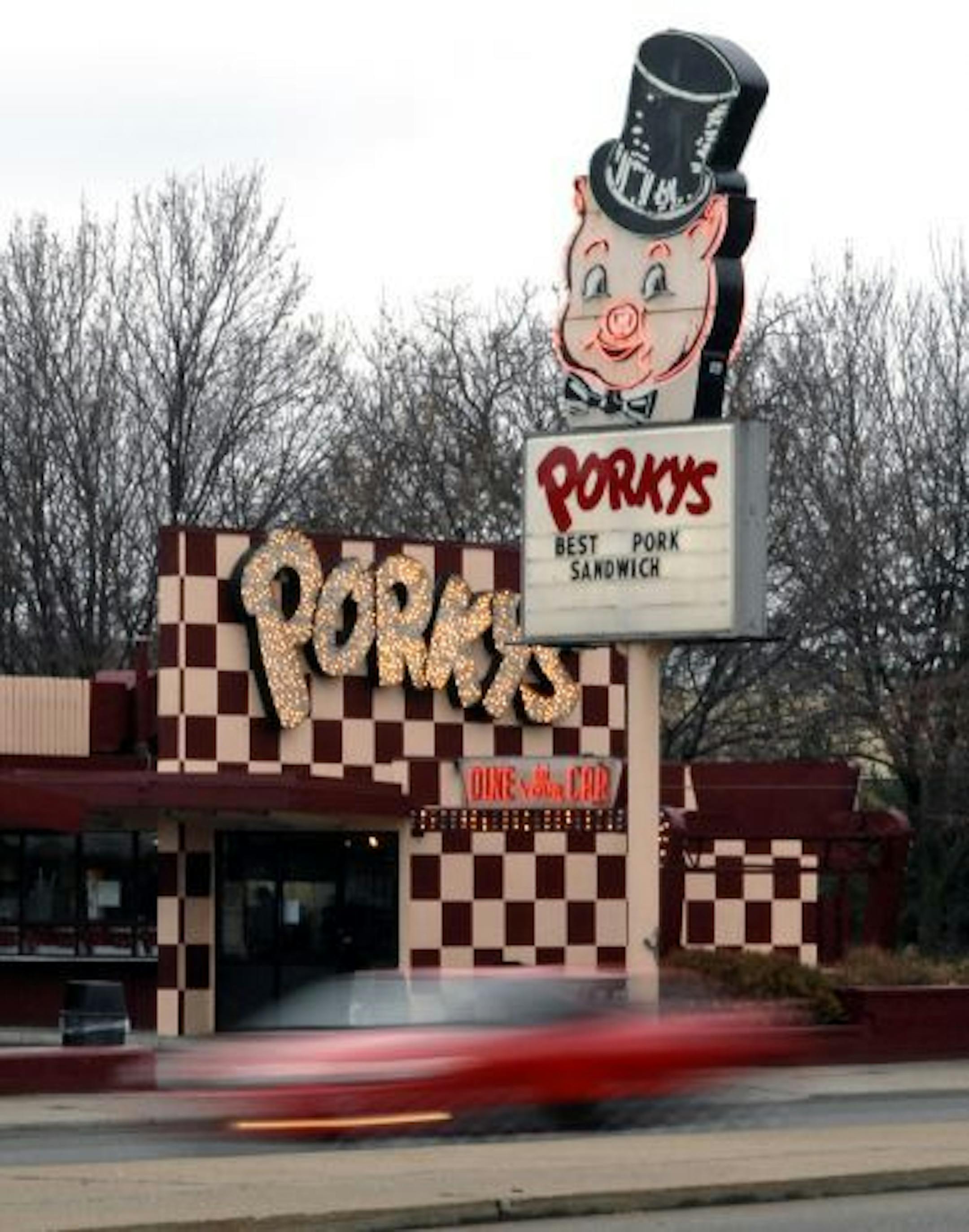
Other chains came along. Sandy’s. Henry’s. Burger Chef. They’re all gone. But each chain had a structure and signage that set it apart — neon logos high on poles, beckoning in the summer twilight.
The apotheosis of the exuberant sign was Arby’s, of course. Its signage didn’t show a sandwich. It showed an absurdly tall hat. Someone from another culture might wonder why there was a hat advertising roast beef, but if you grew up in America, you just knew.
Back then, you could ask someone, “Where do you want to eat, hat or arches?” And they’d know what you meant.


