

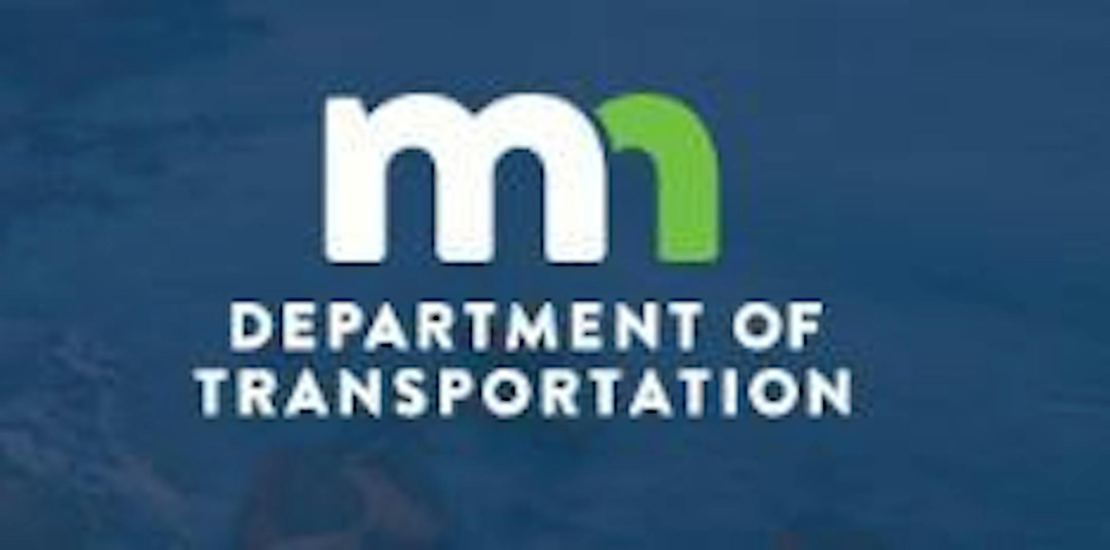
MnDOT is saying so long to its round logo bearing a pine tree and North Star. On Monday, the agency officially began using a new logo featuring a white "M" with a green "N" and the words "Department of Transportation."
The switch to the new logo is simply cosmetic, said spokesman Kevin Gutknecht, and will bring MnDOT in line with other state agencies that also will be using the "M" and "N" as the state works to create a unified brand and better inform residents of services provided by the state.
"The work MnDOT does and the things we do won't change," Gutknecht said.
The new logo now appears on the department's website and 511.org traffic map that shows current road conditions. It's also appears on emails and social media accounts used by the agency to tweet information.
MnDOT has used the blue circle featuring the pine tree and North Star since the agency was formed in the 1970s. It's a logo that Minnesotans have come to recognize as it is emblazoned on road signs, trucks and buildings.
Over the coming months and years, the old logo will be less ubiquitous as the new logo will become more prevalent. Old logos appearing on current signs and equipment will not be replaced. But the new logo will be featured on all new signs and equipment put in service.
MnDOT is one of the first agencies in the state to use the new "M" and "N" following the lead of the Explore Minnesota tourism department, which has been using it for the past three years. The logo was featured at a state recruitment fair last fall and is supposed to be used by all state agencies by July 2017 to "create a more unified look for all of state government," Gutknecht said.
As the new logo takes hold, the only logo MnDOT has ever had won't totally fade into oblivion. Some of those logos are chiseled into the side of buildings, meaning a few will survive the changeover.
