As the Ten Most Superlative Days of Summer draw to a close, let us examine the history of the Skipper Pin. I've been meaning to do this for years, but always forget. It's a rare day you get up and say "hey, I should scan those Aquatennial pins." But I finally did. Here's the classic design:

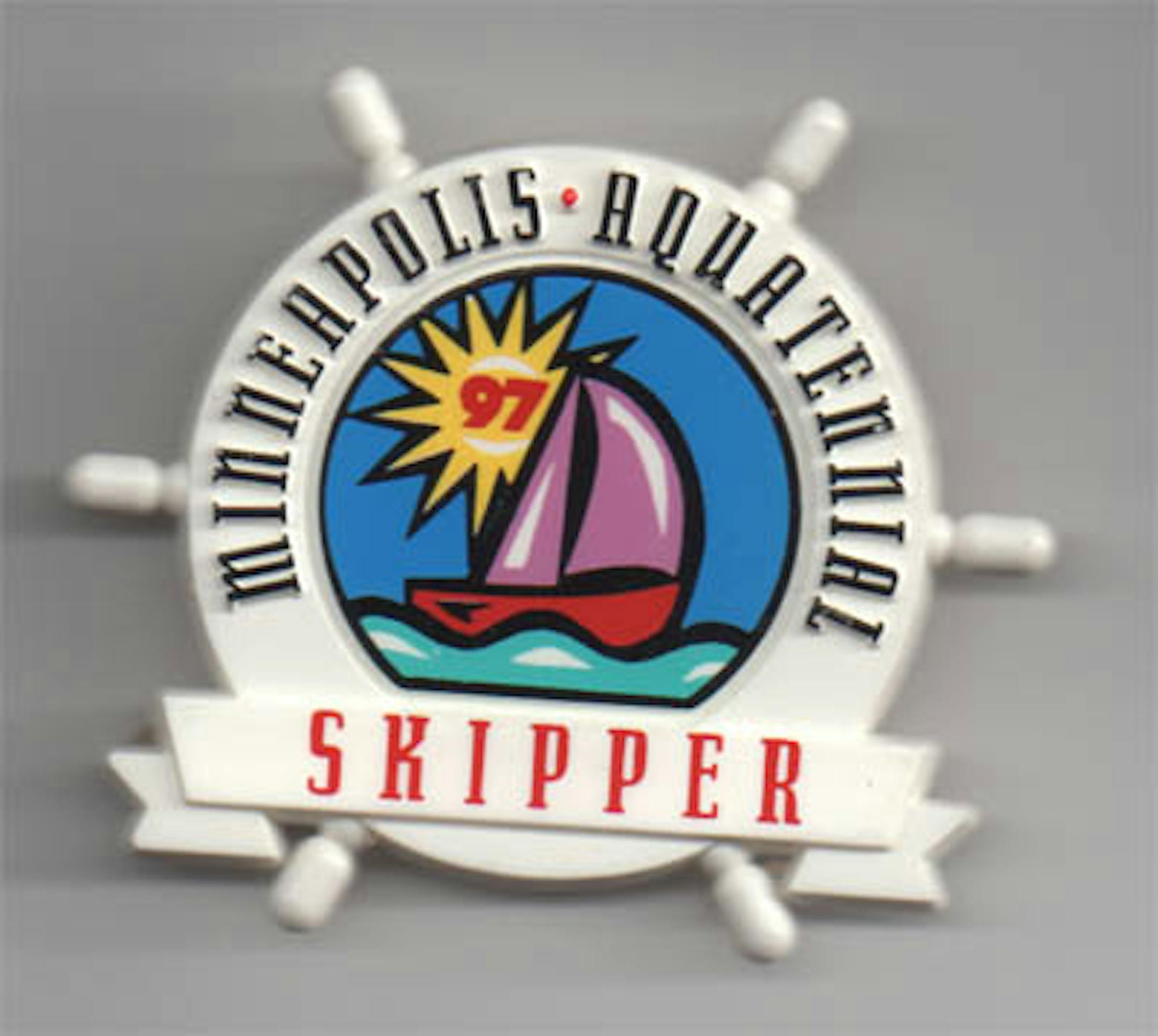
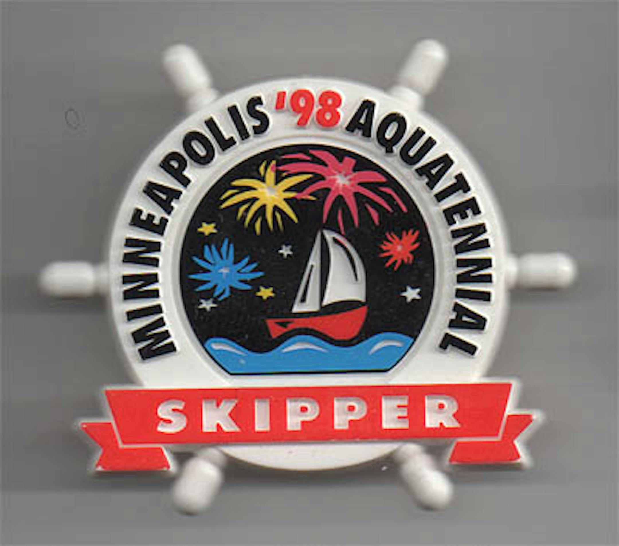
That's as basic as it gets, and it works well. The font is a little spiky, but that would be solved the next year:

In case you're wondering if such a simple design could ever be bad: why, yes.

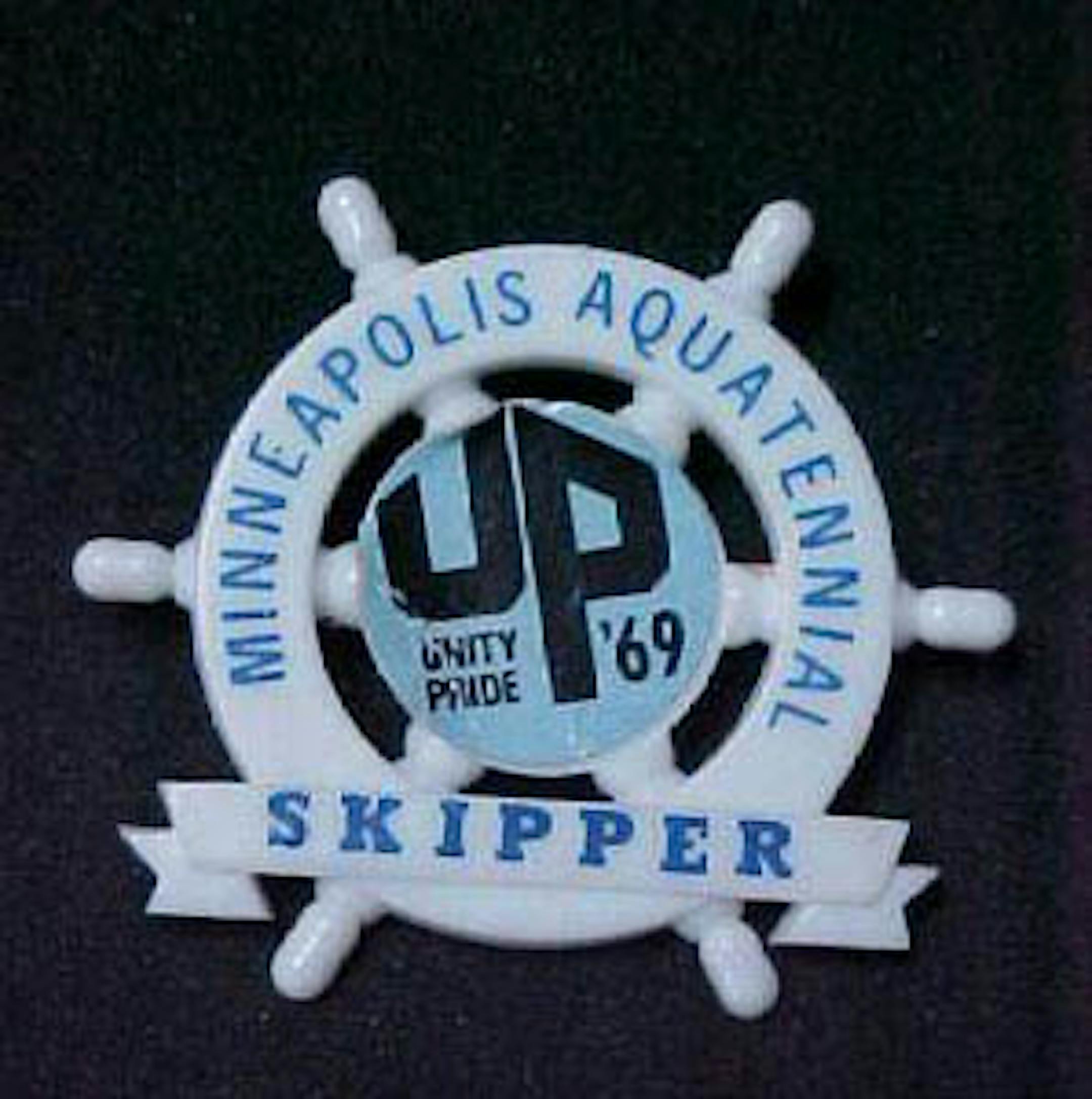
This is from an auction sale - you can buy it for $9.50. The UP stands for Unity Pride, just to complete the hippy-dippy 1969 feel. Nothing was ever as Square as government organizations trying to be Relevant, and Rap with the people in a Meaningful way.

The Milk Carton races are given their due on the 2000 pin:

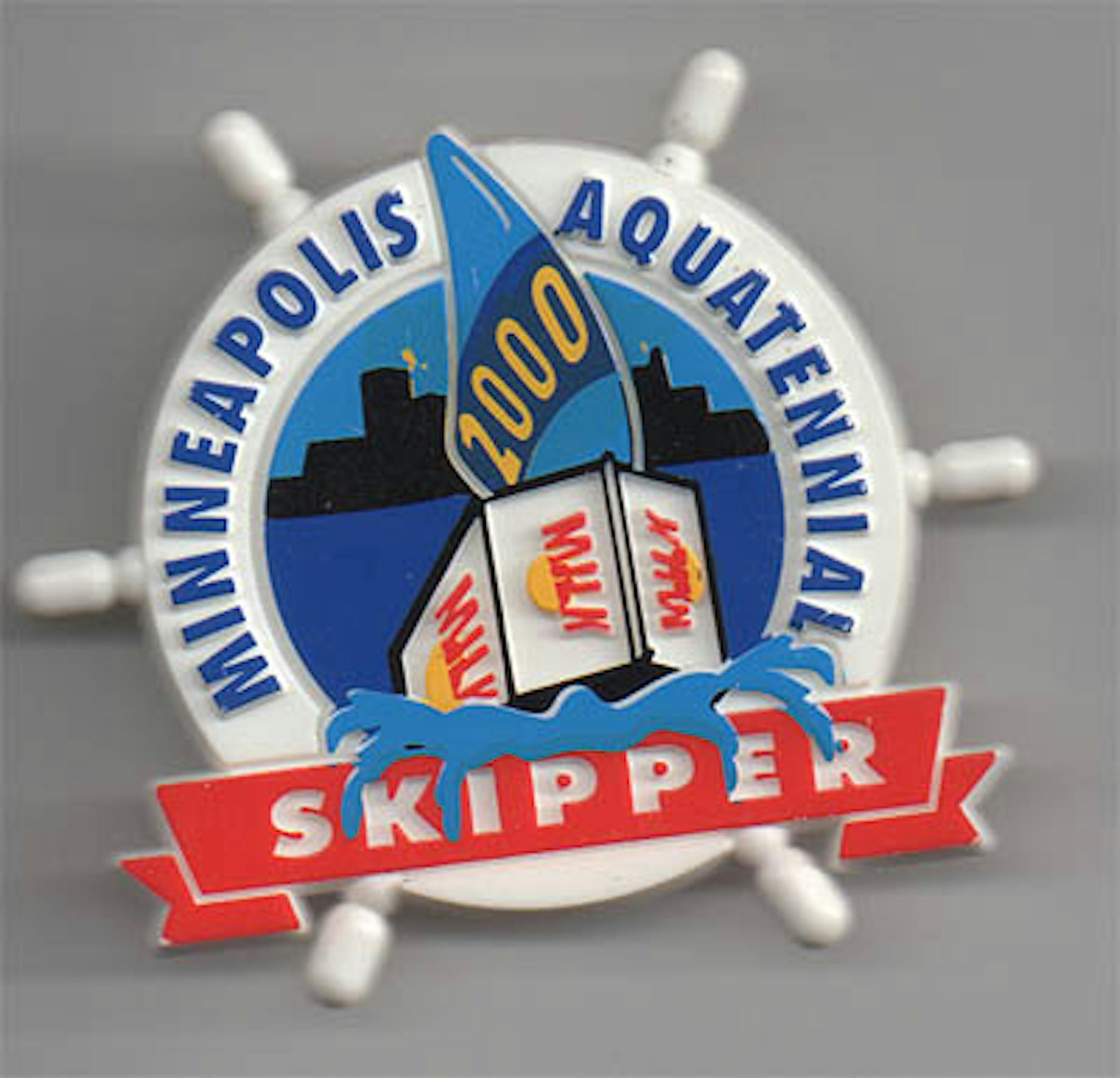
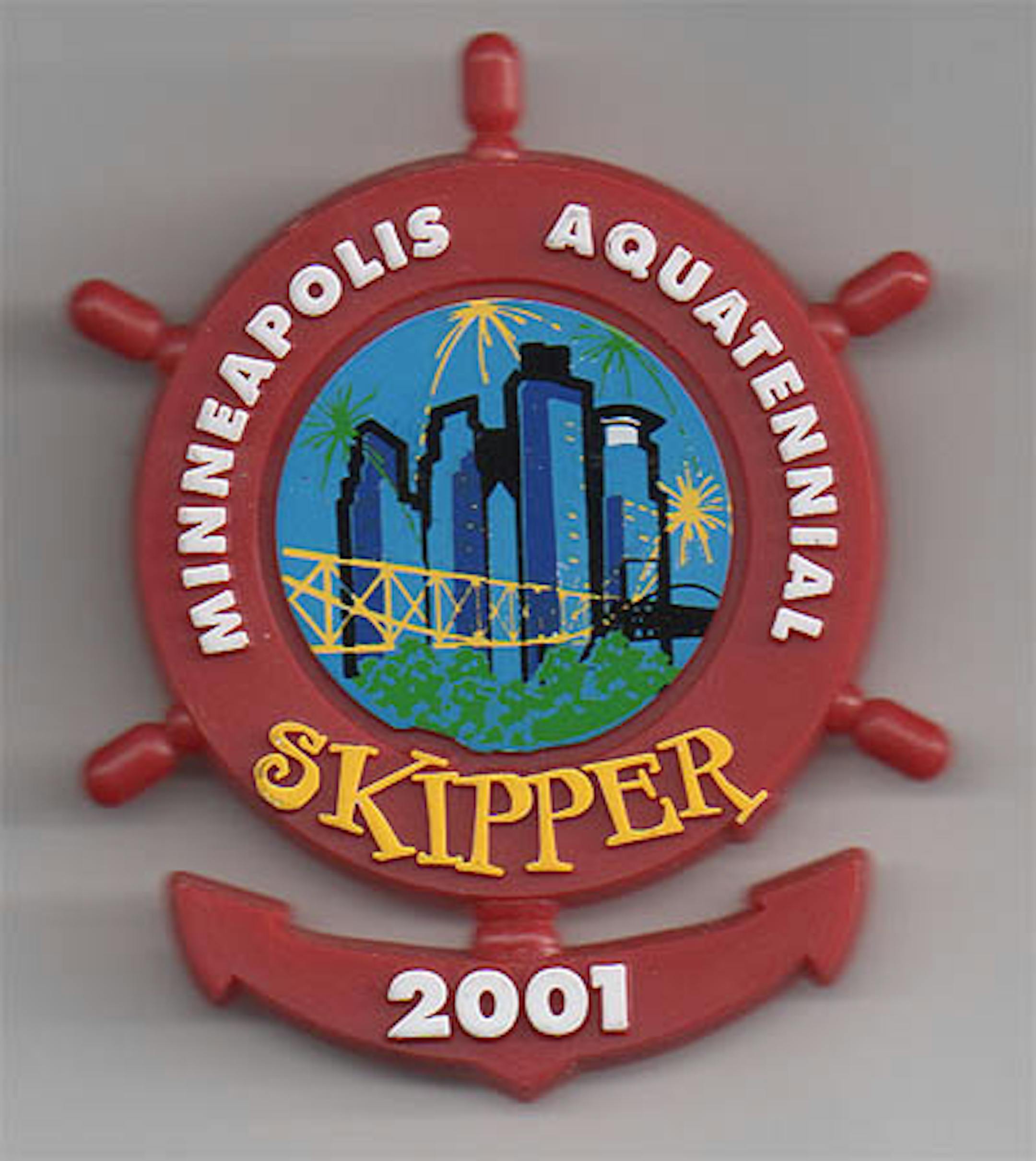
Things are starting to go off the rails the next year - the "Skipper" font is just wacky! and the combination ship-wheel and anchor look like botched vivisection.

Oh heavens no:

Because the thing most people associate with a water-based community event is a brass band.

That was just a warm-up. The wheel is almost lost in the 2002 version, which gets all EXTREME on us. Just the outline of the wheel remains, but it's the 2001 version with the anchor in the bottom.

Why? Did people write angry letters demanding that they stop making pins that demonstrated some sort of historical continuity? By 2003, they'd remade them completely:

Because the thing most people associate with a water-based community event is a brass band.

Better. Notice how the Multifoods building is never included in these tableaus of local skyscrapers? That's because no one likes it. One of these days it's going to turn against us, bitter from the years of indifference. Next: Oh My No.

It's no longer a nifty plastic pin you can easily identify, but an ugly shapeless mess with graphics straight from the mid-seventies, and the the vvisectioned wheel-anchor thing. It doesn't get better:

Note two little holes in the center? Those are lights. It blinks. Here's the current design:

A welcome change, and a step back to the classics. It also looks like first result in a google image search for Generic Minneapolis Badge.

Here's a fellow who has almost every pin. Good for him!

LANCE LAWSON THURSDAY, RETURN OF. Here's a Lance Lawson cartoon from the late 40s. You know about Lance, right? We used to do this at buzz.mn four years ago. I assume you've forgotten all the solutions, so here you go: match wits with Minneapolis' most abrupt and observant detective. Solution tomorrow - see you at lunchtime!