The Minnesota Vikings unveiled their sparkly new uniforms at their Draft Party Thursday night. Yeah, I know the uniform images were surreptitiously leaked all over the Internet earlier this week, but this was our first chance to get an up-close and personal look at the new outfits. If nothing else it was a good pre-draft diversion for those in attendance at Mall of America Field.
I think Vikings fans got what they wanted – a move away from the Denver Broncos-esque template toward an older, simpler time. But they didn't simply go back to a previous version; they gave the new uniform some refinements and flourishes. Had they gone even more modern, toward some Oregon Duck-inspired look, there would have been something of a revolt among the Vikings faithful. And had they attempted some sort of two-toned helmet fiasco akin to what the Jacksonville Jaguars unleashed on our ill-prepared eyeballs this week there likely would have been outright wailing and gnashing of teeth on the floor of the Metrodome. Here are a few shots of the new threads. The first is from the Vikings. The last two are courtesy of Bo Mitchell photography (with a cameo appearance by KARE-11's Eric Perkins):
As you can see, the new uniforms have something of a throwback look.
The overall feel is somewhat reminiscent of their old uniforms from the 1970s and 1980s, especially the pants stripe, which I tried to capture in the final photo below.
I thoroughly enjoy the matte helmet and black facemask. It gives the overall ensemble a more rugged feel… or something. I don't know; I'm just partial to the matte helmet as opposed to the shiny ones most teams are wearing right now. This is clearly a trend, though. A lot of teams will likely be going with the matte hats in years to come. The uniform has a deeper purple, a step away from the nearly-lavender tones (under the wrong lighting) we've witnessed in the past. The gold trim seems sharper and a bit brighter, which is cool. They also did away with the gold "collars" from last year, thankfully. That look never really worked for me. Personally, my favorite part of the new uniforms is the return of the purple pants for road uniforms. I've been calling for the purple pants to make a triumphant and permanent comeback since they first disappeared decades ago. The Vikings dabbled with the purple pants a handful of seasons ago, but they suddenly disappeared as quickly as they reappeared, much to my chagrin. Let's hope they are back to stay this time.
Speaking of the purple pants, there is a version of the uniform not pictured here that includes the pairing of purple pants and purple jersey – the full Barney look. I imagine this look will be saved for special occasions, but I do not have that confirmed. The Vikes added some "curve appeal" to the new jerseys, and I'm not crazy about it. It's my only quibble. That's probably nit-picking, I realize. The striping on the sleeve is toned down and looks pretty sharp, but gets thicker and curves on the back of the jersey. I tried to capture this element on the final photo here – the one where he's talking to Perk. This shoulder stripe curving corresponds to the curving that you probably notice on the edge of the numbers (see the Adrian Peterson examples above). I get what they were going for here – something to do with the curved bow of a Viking ship. This curving will have to grow on me, though. And with that, I think I've gone more in-depth on uniforms than I ever thought I would. I'll stop there. I'm sure Vikings fans reading this post have plenty of opinions on the new uniforms so please feel free to chime in with your thoughts in the comment section below. Do you like them or loathe them? Most importantly to the Vikings and NFL, how quickly will you rush out and purchase yourself a new Vikings jersey? Bo Mitchell is the VP of Content at SportsData You can follow Bo on Twitter at @Bo_Mitchell

Minnesota Sports Hall of Fame: A class-by-class list of all members
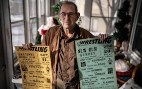
This retired journalist changed professional wrestling from Mankato